When I speak to my fellow carpet cleaners about creating a
web page, often I’m met by lots of misconceptions and myths. I’d like to go ahead and shatter some of
those myths right now.
You should know that:
1)
Building a website doesn’t
have to be expensive (and you can even do it FREE)
2)
There are some basic tips
that will put you way ahead of your competition
Keep Your Website Goals In Mind
When building a website you need to keep in mind your
goals. Why are you actually building the
website in the first place?
For most carpet cleaners, the answer should be “to collect
leads.” Yes, that my friends is the
correct answer. The internet can be a
great source of clients, since more and more people are abandoning the yellow
pages and instead hopping on their computer or smart phone to search for their
local carpet cleaning services. You want
to make sure that when they land on your site, that they will either contact
your or leave their details so that you can contact them back.
Building Websites is Easy
(Even For Carpet Cleaners!)
Contrary to what a lot of people think about building a
website, if our aim is lead capture we really need a very simple website. In fact, in most cases a SINGLE page will
usually be enough. Yes, you head me right!
These single page sites are often called “landing pages” in
the professional lingo. These can be
highly effective at converting customers since they funnel visitors to a
particular goal. There are many web apps
that allow you to create a landing page literally within minutes (or even
seconds). For example, here is an example of a landing page I created in under 5 minutes for free.
The example here is probably a bit limited, because Kick Off
Labs doesn’t allow user to collect other details such as name and phone number,
but you should be able to get the idea.
Let’s look at a website as a case study to point out some of
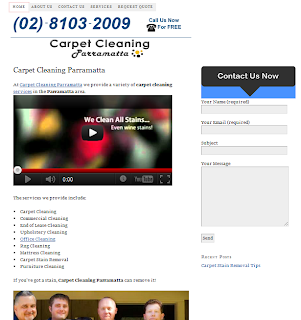
the basics in terms of reaching your goal, which is maximizing conversions. Here is a screen shot of the website Carpet CleaningParramatta:
2 Critical Points For Maximizing Conversions
Prominent phone number
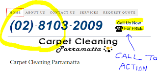
The website displays a phone number very clearly. This is such an easy thing to do yet most
people get this wrong. The phone number
should appear “above the fold”, which means in the section of the screen that
users initially see when they load the page without having to scroll down. The best place to put your phone number is
somewhere in the header. The top right
of the screen is often a good place to put it.
Notice that the website also displays a call to action near the phone number. This is really important since it acts as a
prompt for people to call. When
designing the copy for your website you really need to spell out to users what
they need to do. Often it can help to
have a small arrow point to the phone number in order to draw extra attention.
Prominent contact form
This is another really basic feature that people often leave off
websites. You can give people the option
either to call you directly or to leave their details for you to call back (for
example if they are browsing the web late at night). This is the most basic aspect of lead
generation.
Again in this example, you can see how the Carpet Cleaning Parramatta
website prompts visitors with a clear call to action, in this case “contact us
now”. There are obviously some technical
issues with the form at the moment which should be fixed.
One thing which can be improved here is the button. The button text ideally should be descriptive
and refer to the benefit that the visitor will get by filling out the form. In this example, the “Send” text is not
really descriptive enough, nor is it prominent enough.
As a better example, have a look at the lead generation form on this site (go ahead, you can fill it in to get more great marketing tips for your carpet cleaning business!)
Here you can see that above the form is an instruction (“stick
your name in my box”) followed by the benefit that users will get (“learn how
to get more paying customers for your carpet cleaning business).
The button on this site is nice, big and the color contrasts
with the rest of the site colors, making it stand out. The text has a call to action, saying “sign
up”. This lead generation form could
even be improved by adding risk reversal – for example something like “If we
spam you, spam us back” or something of the sort.
There is quite a science to landing page optimization and
lead generation, but these basics will set you well on your way to collecting
leads that will bring money into your carpet cleaning business. Make sure that your phone number is clearly
displayed – you can ask a friend to fetch your phone number from the website
and time how long it takes them to do it.
Also make sure you have a kick arse form to draw in leads.
If you need help with designing a great form or wording the
copy, just sign up to our newsletter to get loads of free tips. You can feel free to email us back with any
questions and we’ll make sure to give it our best shot.


